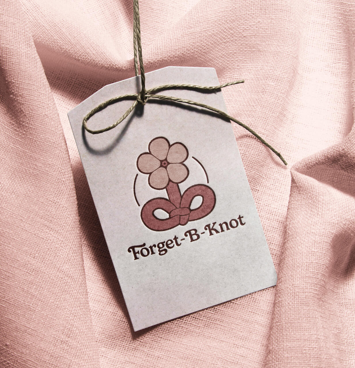
Forget-B-Knot Rebrand
The purpose of this project was to create a compelling rebrand for Forget-B-Knot. They are a small macrame and fibre art business based in Ottawa looking for branding that suits their handmade whimsical pieces. Their products are primarily targeted towards people who attend craft fairs that value creativity, craftsmanship, and supporting local businesses.
Categories
Stats
- Branding
- Logo Design
- Research
- Concepts
- Primary & Secondary Logos
- Brand guide
Highlighting the unique selling point through logo design
Since Forget-B-Knot is recognized for its original potted plant pieces, the logo sketches highlight this unique selling point that differentiates it from other macrame and fibre art businesses. The design incorporates the imagery of a forget-me-not flower, combined with a knotted rope as the leaves of the plant to represent the play on words in the brand’s name. The logo’s type was also customized to lean into the brand’s whimsy and creativity. Through discussions with the client, we determined that adding dashes to the brand name would make the name more legible. These changes made the final logo more effective and readable.


A whimsical and hand-made brand
The final logo and brand guide deliver an enhanced image of the brand that highlights its unique and whimsical tone. The client was very happy with how well the new logo and overall branding spoke to the spirit of the brand and its audience. Looking back at the final design, I think that if there were more time available I would spend more time creating more graphics to further elevate the brand’s appearance.
Get in touch
Let's create something amazing together!


